You’ve been staring at the tackle box for five minutes. The water looks good, the wind is right, but you have forty shades of plastic and no idea which one the bass want. We’ve all been there. The worst part is that the wrong choice costs you more than time—it costs you strikes you never even knew you had.
Here’s the truth about lure color: it matters less than most anglers think, but more than the guys who say “they’ll hit anything” will admit. The secret is not memorizing a giant color chart. It’s learning a simple decision-making sequence that eliminates the guesswork. This article gives you that sequence—a three-step framework based on water clarity, light conditions, and depth. You’ll also get a species-specific cheat sheet and a field test method that settles arguments in ten minutes, not a whole season.

Generic
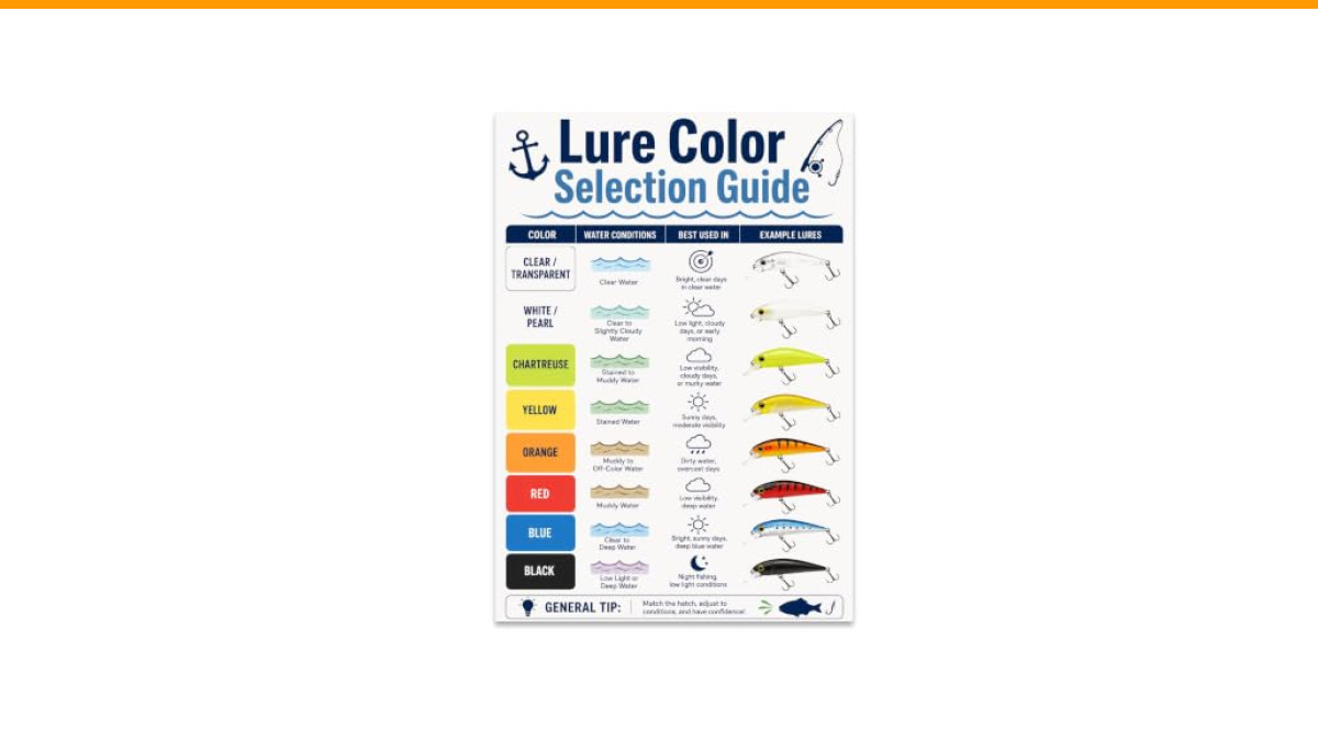
Fishing Poster - Lure Color Selection Guide - 13x19
- LURE COLOR SELECTION GUIDE: Organizes common lure colors with illustrated examples and quick selection cues for anglers planning f…
- QUICK VISUAL REFERENCE: Clear color bands, labeled examples, and a compact layout make lure options easy to compare at a glance.
- 13X19 GLOSSY POSTER PRINT: Printed on glossy paper for crisp detail, readable labels, and bright color in a clean vertical format.
If you want a quick visual anchor for your tackle room, a fishing lure color selection guide poster works well. It organizes common colors with illustrated examples and quick cues, which helps when you’re planning a trip or teaching a kid the basics. It’s a handy reference, but it doesn’t replace the logic below—it just makes it easier to remember.
The 3-Step Rule of Thumb for Lure Color Selection
Most color guides fail because they give you a list of colors and conditions, but no order of operations. You end up with a random guess. The fix is to run a quick three-step check before you tie anything on. Think of it as a mental flowchart.
- Read the water clarity. Is it clear, stained, or muddy? This sets your base palette.
- Assess the light. Bright sun, overcast, or dark? This adjusts your base palette for contrast.
- Consider depth. How deep are you fishing? This determines how much color actually survives to that depth.
Run these three steps in order, and you’ll narrow a wall of options down to two or three realistic choices. That’s the whole game. The rest is confidence and action.
Step 1: Read the Water Clarity (Clear, Stained, Muddy)
Water clarity is the single most important factor in color selection. It dictates how far a fish can see your lure, which changes what color actually means to them.
Clear water (visibility over 6 feet): Fish have time to inspect your offering. They will see the details, so you should use natural, realistic colors. Think shad, bluegill, crawfish patterns—anything that matches the local forage. In gin-clear lakes, go with subtle tones like smoke, watermelon, or natural shad patterns. Keep the flash minimal.
Stained water (visibility 2 to 6 feet): This is the most common condition on most lakes. Fish see a silhouette more than a detailed pattern. You need to add contrast. Chartreuse and white is a classic combination for a reason—it mimics a baitfish’s flash while still being visible. Firetiger patterns (chartreuse, orange, green) work well here too. They don’t match anything in nature, but they don’t have to. They look like a meal that’s easy to see.
Muddy or turbid water (visibility under 2 feet): Stop trying to match the hatch. The fish cannot see the hatch. They are relying on vibration, sound, and silhouette. Go with dark colors that create a strong silhouette against the surface light. Black, black/red, and black/blue are your best friends. These colors don’t disappear in low visibility—they block light, creating a shape the fish can detect from a distance.
The “Natural vs. Contrast” Spectrum for Each Clarity Level
Here is the mental model that ties it all together. Every lure color sits on a spectrum between “natural” and “contrast.”
- Clear water: Slide all the way to the natural end. Match the hatch, keep it realistic.
- Stained water: Slide toward the middle. Use colors that are still natural-ish but with a brighter flash or a louder profile.
- Muddy water: Slide to the contrast end. Dark colors or ultra-bright chartreuse—anything that screams “food” without needing detail.
Understanding this spectrum stops you from overthinking. You aren’t picking a color; you’re picking a position on a line.
Step 2: Assess Light Conditions and Sky Cover
Water clarity sets the baseline. Light conditions are the modifier. The same water looks different at noon versus dusk, and your lure color should change accordingly.
Bright sun, high sky: The sun bleaches out colors, especially in shallow water. Lighter, more translucent colors work best. Natural shad patterns, light green pumpkin, and silver finishes will outperform dark, bold colors. Dark lures in bright sun create a harsh silhouette that can spook wary fish in clear water.
Overcast or cloudy: Cloud cover diffuses the light, removing harsh shadows. This is when you can step up your visibility game. Chartreuse, white, and firetiger patterns become deadly. The low light makes these colors appear more natural while still being easy to track. It’s also the best time to throw reaction baits with a bit of flash.
Heavy cloud cover or rain: The water gets darker, and you need to go darker with it. Black and blue, junebug, and dark purple are solid choices. These colors maintain their silhouette even in dim conditions.
Bright Sun vs. Overcast vs. Night Fishing (The Black/Blue Rule)
Night fishing is a different animal. Conventional wisdom says dark colors are best, and that’s mostly true. Black and blue is the go-to for a reason: it creates the strongest silhouette against the night sky’s ambient light. It doesn’t reflect light; it absorbs it, making the lure’s shape unmistakable to a fish looking up.
But there is a counterintuitive trick. On moonlit nights, or when fishing around dock lights, switch to a white or silver lure. The light from the moon or the dock lamp hits the white surface and creates a flash that mimics baitfish. It’s the only time you’ll hear me recommend white at night, but it works.
For extreme turbidity during the day—think chocolate milk water—the black/blue rule still applies. The dark color provides the contrast you need against the murky surface. Firetiger also works here, but only if the water has a slight green tint. Pure mud? Go black.
Step 3: Match the Hatch (But Don’t Overthink It)
Matching the hatch is the most overused phrase in fishing. It’s also the most misunderstood. Matching the hatch means your lure roughly resembles the size, shape, and color of the primary forage. It does not mean you need a paint job that rivals a taxidermy mount.
Here is the practical version. If you see shad jumping, throw a shad-colored crankbait. If the bass are eating bluegill, throw a bluegill pattern. That’s it. The size and action of the lure matter more than the precise shade of the belly.
But here is the caveat: matching the hatch only works when the fish are actively feeding on that forage. When they are not, you need to trigger a reaction strike.
When to Break the Rules: Triggering Reaction Strikes with Flash
A reaction strike is a reflexive hit. The fish isn’t hungry; it’s annoyed, territorial, or just curious. To trigger this, you need contrast, flash, or vibration—not realism.
This is where colors like chartreuse, white, and anything with a flashy holographic finish shine. A bright spinnerbait with a chartreuse skirt doesn’t match any natural bait, but it irritates bass into striking. This is also why a silver spoon is a timeless choice. The flash is unnatural, and that’s the point.
So the rule is simple: match the hatch for neutral or negative fish. Break the rules for aggressive fish. If you’re catching nothing on natural colors, switch to something loud. The worst that happens is you keep catching nothing, but at least you’ll know it wasn’t the color.
The Science of Depth: Why Red Disappears First
Most anglers know color fades with depth, but they don’t know the order. It’s not random. It’s physics.
Water absorbs light, and it absorbs colors at different rates. Red is the first to go, disappearing at around 15 to 20 feet in clear water. Orange goes next, then yellow, then green. Blue and purple penetrate deepest, which is why deep-water lures are often blue or purple.
This has a practical implication. A red crankbait is a great shallow-water lure. At 20 feet, it looks gray or black. So if you’re fishing deep, the color you tie on is less important than the color that survives the trip down. You can use a bright chartreuse lure at 30 feet, but it’s going to look like a muted green. You might as well use a darker color that keeps its silhouette.
The takeaway: don’t waste money on fancy deep-diving lures with intricate paint jobs. The fish can’t see the details. Focus on silhouette and action at depth.
Quick-Reference Color Chart by Species (Bass, Walleye, Trout)
Here is a practical starting point for three common species. These are not absolute rules; they are baselines based on typical feeding behavior and water preferences.
| Species | Clear Water | Stained Water | Muddy Water | Notes |
|---|---|---|---|---|
| Largemouth Bass | Watermelon, green pumpkin, shad | Chartreuse/white, firetiger | Black/blue, junebug | Bass are sight feeders. Contrast triggers reaction strikes. |
| Smallmouth Bass | Smoke, natural crawdad | White, chartreuse | Black/red, dark brown | Smallmouth often prefer smaller profiles than largemouth. |
| Walleye | Perch, shad, natural minnow | Chartreuse, orange, gold | Firetiger, bright orange | Walleye have excellent low-light vision. Gold is a classic for stained water. |
| Trout | Natural insect, small minnow | Black with gold flake, orange | Bright orange, chartreuse | Trout are more scent-sensitive than color-sensitive. Keep the presentation natural. |
| Panfish | Natural cricket, small worm | White, yellow, chartreuse | Bright yellow, red | Panfish are curious. Small, bright lures often outfish natural ones. |
Use this table as a starting point, not a rulebook. The water conditions on your lake will always override a general chart.
How to A/B Test Colors on the Water (The 10-Minute Rule)
You can read every article on color theory, but the real answer lives in the water you are fishing. Here is a simple field test to settle any debate in ten minutes.
First, pick two lures that are identical in size, shape, and action. The only difference should be color. One should be your “natural” choice, and one should be your “contrast” choice.
Fish the first color for five minutes. Cast in a consistent pattern, covering the same type of structure. Count every strike, even if you miss the hookset. After five minutes, switch to the second color. Fish the exact same area, the same retrieve speed, the same depth. Count the strikes again.
The color with more strikes wins. It’s that simple. The key is to make sure you are fishing the same water and the same action. If you change the retrieve or the depth, you’ve ruined the test.
This method works because it isolates the variable. You aren’t guessing; you’re measuring. Do this a few times a season, and you’ll build a personal color chart that beats anything you’ll read online.
Final Checklist: 3 Questions to Ask Before Tying On
Before you make your next cast, run this quick mental checklist. It takes ten seconds and saves you an hour of unproductive fishing.
- What is the water clarity? Clear, stained, or muddy? This sets your base palette.
- What is the light doing? Bright sun, overcast, or dark? This adjusts your contrast level.
- How deep am I fishing? If it’s over 15 feet, stop worrying about exact color and focus on silhouette and action.
If you can answer these three questions, you will never stare blankly at a tackle box again. You’ll have a reason for every lure you tie on, and you’ll catch more fish because of it.
Remember, lure color is a tool, not a magic trick. It won’t save a bad presentation or a poorly chosen location. But when everything else is right, the right color can be the difference between a good day and a great one.